Tuesday, 27 December 2011
Journal--- Week 3
This week we designed and created the production company thuat will appear before our tittle sequence, we also finished and put the final tweaks to our soryboard. we are now basically at the point where we can film the opening sequence, we just need to go out and ge our props soterd but we can do that anytime. the weather is also important for our shoot we preferably need a clear night sky and it can't rain at all, we are filming oustside and with fire so it is hugely important that it does not rain.We chose to film at night as it's a horror film and we feel that vhis will add to the tension of the sequence.
Saul Bass
For our coursework we have to create a title sequience and i am going to look at different designers i have already looked at the Dutchman, Joost Korngold, and now i will look at one of the most famous title designers Saul Bass.
Timeline
He was born in 1920 in New York
He studied at an arts studewnt league under Gyorgy Kepes
After this he worked as a freelance grpahic designer or commercial artist
Moved to Los Angeles in 1946
In 1950 he opened his own studio
Worked in advertsiing until 1954
And made his first mark on the film world in 1955
During his 40-year career Bass worked for some of Hollywood's greatest filmmakers, including Alfred Hitchcock and Martin Scorsese. Amongst his most famous title sequences are the animated paper cut-out of a heroin addict's arm for Preminger's The Man with the Golden Arm, the text racing up and down of the United Nations building in Alfred Hitchcock's North by Northwest, and the disjointed text that races together and apart in Psycho.
He worked on several films, the most notable including:
Goodfellas (1990)
West Side Story (1961)
Ocean's Eleven (1960)
Psycho (1960)
Spartacus (1960)
Tuesday, 13 December 2011
Production Company Logo

H- Harj
A- Aaron
R- Ryan
J- James
Thursday, 8 December 2011
Journal- Week 2
This is the second week of my journal, again i will talk about what i have done this week and what we hope to do. This week we storyboarded our title sequence, and tried to find music for it.We created 14 shots on our storyboard but we also involved camera movements so we are very sure that we can make the title sequence least the minimum of 2 minutes. The storyboard was mainly what we wanted it is completely focused around the theme of fire. we decided on the location of our sequence. we have got to the point where we are nearly at the point where we can film it. we do however still have to find un-copyrighted music to use or if the music is copyrighted we have to right to the company and ask for permission to use it.also we need to find somewhere that we can buy fake scars/burns or find a recipe so that we can make our own as the scars/burns are a hugle important part of our sequence.. finally we will have to find out who would distribute/create our film so that we can put their logo at the start of our title sequnce so that it looks professional.
Tuesday, 6 December 2011
Typography

This is the type of Typography that we are thinking about using during our title sequence. we would color it grey and have it rising out of the fire that will be the centerpiece of our title sequence. this writing looks like smoke and this fits the theme of our title sequence. this will be the text used throughout the title sequence as the fire will be in every shot and it will be the easiest to put seamlessly into the title sequence.
Codes And Conventions Of A Title Sequence
The codes and conventions of a title sequence are:
The cast and crew
The title of the film
Indication of place, time and historical period.
Mis-en-scene
Introduction to character
Sets up enigmas
There are different codes and conventions for different genres of films. the genre that we have chosen is horror :
Often filmed in a dark and sinister place
Quick shots during editing
Dark music
Plot frequently involves death
Usually involves good and evil
Film distribution---The Sitter
Media the sitter
View more presentations from AaronVander.
Above is the presentation that me and Dominic Coleman made for film distributors. The film that we chose was 'The Sitter' a film that was yet to be released. we found out who was distributing the film, what other films that they had distributed as well as a general overview of the film distributor. finally we found out about who the target audience for the film is.
Above is the presentation that me and Dominic Coleman made for film distributors. The film that we chose was 'The Sitter' a film that was yet to be released. we found out who was distributing the film, what other films that they had distributed as well as a general overview of the film distributor. finally we found out about who the target audience for the film is.
Title sequence Analysis--- halloween
This is the opening sequence to the film Halloween, directed by John Carpenter, who will also direct our film. the opening titles are written in orange with a pumpkin next to it. This represents halloween as the colors used are black and orange.The writing is written in orange as this links with the pumpkin next to it the whole thing is growing in orange like the flame within a jack-o-lantern . The background is very plain i believe that this is because they want you to focus on the people that are actually in the film rather than something that going on behind them. Also the music used in the sequence is very tense adding to hinting to the fact that the film is very tense.
Friday, 2 December 2011
Films Similar to Ours Number 3--- Carrie

Carrie is American author Stephen King's first published novel, released in 1974. It revolves around the eponymous Carrie, a shy high-school girl, who uses her newly discovered telekinetic powers to exact revenge on those who tease her. King has commented that he finds the work to be "raw" and "with a surprising power to hurt and horrify." It is one of the most frequently banned books in United States schools.Much of the book is written in an epistolary structure, through newspaper clippings, magazine articles, letters, and excerpts from books.
Several adaptations of Carrie have been released, including a 1976 feature film, a 1988 Broadway musical, a 1999 feature film sequel, and a 2002 television movie.
Although originally a book Carrie was later turned into a film and shares many similarities to are story. Firstly she is bullied at school becasue she is different to everyone else similar to our film. and she gets revenge on those who bullied her like in our film. Of all the things that are similar to ours this one shres the closest likeness i believe.
Films Similar to Ours Number 2--- Halloween

Halloween is a 1978 American independent horror film directed, produced, and scored by John Carpenter, co-written with Debra Hill, and starring Donald Pleasence and Jamie Lee Curtis in her film debut and the first installment in the Halloween franchise. The film is set in the fictional midwestern town of Haddonfield, Illinois. On Halloween 1963, six year old Michael Myers murders his older sister by stabbing her with a kitchen knife. Fifteen years later, he escapes from a psychiatric hospital, returns home, and stalks teenager Laurie Strode and her friends. Michael's psychiatrist Dr. Sam Loomis suspects Michael's intentions, and follows him to Haddonfield to try to prevent him from killing.
Thsi film is similar to ours for two reasons firstly once again the killer is a child, well for the first part anyway, but more importantly the main character disappers for an extended amount of time over which the rage builds up and eventually he kills. This is simialr to the plan of our story as you can see from our plot that he disappears and over time the rage builds inside him.
Films Similar to Ours Number 1--- The Omen
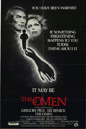
The Omen is a 1976 American suspense horror film directed by Richard Donner. The film stars Gregory Peck, Lee Remick, David Warner, Harvey Stephens, Billie Whitelaw, Patrick Troughton, Martin Benson and Leo McKern. It is the first film in The Omen series and was scripted by David Seltzer, who also wrote the novel.
An American ambassador learns to his horror that his son is actually the literal Antichrist.
The main reason that this film could have inspired ours is that the main character in this film is a child and that is the angle that we are going for in our film. It is unusual that this is the case as as normally in horror films it is adults that are the main characters. Our film title also cam from this film as our film is called Damien and that is considered the devils name becasue of this film.
Film Title Presentation
This is the presentation that was made for when we pitched our film idea to the class we stated.
The Plot of the Film
The Cast and Crew
The Title Sequnece
Films That Have Inspired Ours
And Costs
The Plot of the Film
The Cast and Crew
The Title Sequnece
Films That Have Inspired Ours
And Costs
Thursday, 1 December 2011
Journal-Week 1
Starting from this week I will be doing a weekly journal, updating you on what is going on in my group for media coursework. I have decided to start this up at this time as we have just started to create are film idea that will eventually be made into a title sequence.
This week my group, Ryan Emin, James Mills, Harjinder Chana and me assigned roles that we would be in control of, we decided that we needed to allocate roles so that we all knew what we were doing and were fully prepared. The roles that we assigned ourselves were as follows:
Aaron---Director
Harj---Cameraman
Ryan---Editor
James---Actor.
We were all comfortable with the roles we were given, everyone will know what they are doing when we come to filming and in the long run this will save us time.
The film's title will be Damien, as described in a previous post along with are title sequence idea. My next post will be the powerpoint presentation that we used to pitch to the class that will go more in depth about the film, the people who will star in it, and who will direct it.
Sunday, 27 November 2011
Film Distributors
What does a film distributor do:
Advertising
Marketing
Synergy/Partnership with production company
Distributes films
Premieres/Home releases
Produce content to make it available to the public
Delivers the film
Film related content (Trailers,posters,teasers)
Release it to the public
The film distributor is the link between the producer and the exhibitors (cinema chains, TV networks). there aim is to get as many people to watch the film as possible. They also make the film an appropriate ad campaign and make sure it targets the right audience.
Media Coursework- Film Idea
My group for media coursework:
Aaron Vander
James Mills
Ryan Emin
Harjinder Chana
Our tile sequence idea for our coursework is a horror film, to which we have not decided the name yet but the plot will be that a normal child is one day caught up in a house fire and is left significantly disfigured because of the burns he has suffered. upon returming to school he is continously bullied by other students, and eventually he runs away and hides himself from normal people. over a number of years the anger grows inside him, to the pint where he hunts down those that bullied him, and to get revenge burns therer face, so in his eyes they are equal to him, and then he kills them and keeps there heads as a shrine.
The title sequnece will be focused around fire, fire wikll be in every shot of the sequnce and the main characters face will be hidden under a hood right up until the end of the title sequence. the typography that i would like to use is that of a smoky type of writing so as the fire burns in the title sequnce the names of actors,directors etc. appears written out of smoke again adding tho the thme of fire.
Over the top of this we are not sure whether to have a voiceover of the main charcter speaking about his expieriences and 'the fire inside him'. or whether to have music that fits in with the film genre, the music would have rock music or a similar genre to that as that is normally the tye of music assciated with thsi film genre. A song i believe would be a good choice is Been To Hell by Hollywood Undead.
Thursday, 24 November 2011
Duel-- Film Pitch To Warner Bros.
Our pitch
View more presentations from AaronVander.
This is the presentation that i created with James Mills and Jasmine Winston for our film duel, a superhero film with a twist. We were pitching to Warner Bros.
We chose
This is the presentation that i created with James Mills and Jasmine Winston for our film duel, a superhero film with a twist. We were pitching to Warner Bros.
We chose
Friday, 18 November 2011
Groundhog Day Title Sequence


This is our opening sequence that was made by me and Dom Coleman. We focused on the theme of repetition with the character walking past the same background repeatedly, and we also have the title sequence finish where he started in bed. The film shows the same day being repeated over and over again, so we decided to try and get it across in the title sequence.
Thursday, 17 November 2011
ZombieLand
This is the opening sequence for the film Zombieland. The first thing that you notice about the title sequence is the titles themselves and how they are actually part of the title sequence rather than just, words added after. The way that when people collide with them and they break apart really draws the audience’s eye to them, almost as if people really want the titles to be noticed rather than them just focusing on the title sequence that is playing over the titles. They almost being wiped away off the screen as if they are blood rather than being smashed through.
The sequence is very chaotic with people running everywhere in panic running away, this could possibly be a theme throughout the film, the theme of chaos and people trying to escape. One of the first shots is of a zombie prisoner throwing a prison guard over a rail. This to me is important as it shows that the virus, or whatever it is affecting people can reach anyone, even prisoners who are locked up 24/7 and are usually kept away from people. Added to this fact is that it shows people from many different areas, different jobs, and different sexes. Every shot shows someone different being affected backing up the idea that anyone and everyone can be affected.
Iconography is also very important in this particular sequence; in every shot something easily recognisable is shown. Zombies are shown in every shot along normally with blood. Both tie closely to the genre of the film, which is horror. The fact that the colour of the writing, which is red, is also important, this connotes blood which one again ties back to the genre of the film.
The sound track matches well to the sequence it fits with the images being shown. It talks about fighting and killing both of which are shown in the sequence. The music also plays a big part in the sequence, it is sung by a Metallica, a metal band, and that type of music is usually more associated with horror films more than any other.
Joost Korngold
This is my presentation on Joost Korngold, a Dutch title designer for my media homework. I chose him mainly because I saw the opening for his film/documentary "Devil's Drug" which is about a drug addict. And after seeing that sequence I knew that this was the title designer I wanted to create a case study on.
Monday, 14 November 2011
History Of The Title Sequence- Homework
Words and lettering played an enormous role in films of the silent era. Film titles made their appearance in the earliest silent films, along with letter cards (or inter-titles), which provided context. These cards were the responsibility of the lettering artist, who collaborated with the scriptwriter and director to create narrative continuity so that audiences could follow what they were seeing.
This is interseting beacuse it shows how important, the actual words were before sound came along. Speech and all sound in the film world was not used and dialouge was shown through the use of letter cards. This to me shows how important text was then because the whole film depended on the text to get the whole point of the storyline across.
During the 1920s and ’30s, European cinema was deeply influenced by modernism, and aspects of this visual sensibility were brought to the US by filmmakers who were fleeing the Nazis. Meanwhile, the studio systems operating in Europe and Hollywood also delighted in creating titles that featured vernacular graphic novelties. As much as possible, they liked to convey the tone of a movie through the “dressage” of its main title. Thus, blackletter fonts in the opening credits were used to evoke horror, ribbons and flowery lettering suggested love, and typography that would have been used on “Wanted” posters connoted a western flick.
This is intersesting because it shows that even when imagery in title sequences was new people still put alot of thought into the images that were shown, as it says above flowers were used to show love and the text from a wanted poster was used to symbolise a western. These are very early examples of the use of typography and Mis-en-Scene. and how they can affect a film even in the title sequence.
Breakthrough ideas in titling, such as timing the typography to interact with metaphorical imagery or to create its own world, were largely innovations that came from outsiders to the Hollywood studio system. Figures such as Saul Bass, Pablo Ferro, Maurice Binder and Richard Williams arrived on the scene in the 1950s, at a time when the studios were starting to flounder in their fight with TV. At that time, independent filmmakers made commercial headway by doing things differently, spreading utterly fresh ideas about the possibilities of title sequences. This is the era in which the discipline of film title sequence design was actually born
This is intersting as it shows that the film industry needed something new as if it wanted to keep up with the TV industry the film industry needed to change. this is when film titles began to change and influental designers like Saul Bass apperaed on the scene, and began to change and the title sequence actually became a pert in the film it was no longer just to announce that the film was starting.
Tuesday, 1 November 2011
This is my continuity sequence for my media A-level. I worked with Harjinder Chana, Ryan Emin and James Mills. Within the group we assigned roles to one another the roles were:
James- Actor
Harj- Actor
Aaron- Cameraman
Ryan- Director
Our fisrt over the shoulder shot is correct, the rest however of the conversation between James and Harj was not right. we broke the 180 degree rule throughout the rest of the conversation we did notice this in editing but did not have time to correct it so we posted it anyway.
The things that I liked about are piece was that it was funny, the sequence as whole was done in a light hearted, funny manner, despite the serious situation being shown. Another thing that i was happy was how well we worked in a team, we had good communication whilst drawing the storyboard and also during the filming we all had some input and all listened to what each other had to say.
The thing that i was not happy with in our piece was the fact that we broke the 180 degree rule as i felt that we had a really good piece without any real mistakes until we made that major one. As the cameraman i do feel mostly responsible, however no one else did poin this out to me so i'm not completely to blame. Another thing that we did wrong is that we had actually filmed it before, but we didn't use a tripod whilst recording so we had to record again as the footagee was shaky.
Subscribe to:
Posts (Atom)